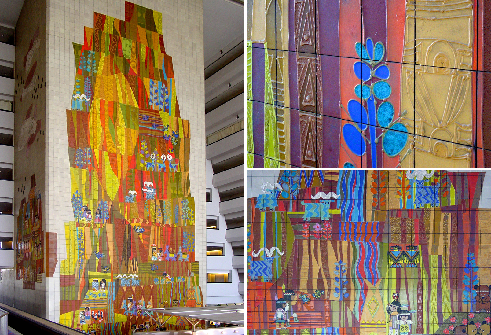
Detail images from The Grand Canyon Concourse ceramic mural, 1971. The Contemporary Resort, Walt Disney World. Mary Blair.
We usually think of super-graphics as large letterforms on a wall, or broad multicolored stripes that run along a hallway. These are often designed to overcome bland spaces, as if somehow, magically, a giant “A” can transform a boring office into a wondrous experience. But there are other types of super-graphics that do more than just fill space. Mary Blair’s Grand Canyon Concourse mural in the Contemporary Resort at Walt Disney World is a super-graphic that transforms the architecture. Designed by Welton Becket and opened in 1971, the Contemporary was a demonstration of new construction methods and technologies. The steel frame was constructed and individual rooms were “plugged” into the slots, like drawers in a dresser. The monorail track runs through the central cavernous space.
During the planning, it was clear that the canyon-like interior atrium could easily become less than cheerful with its Brutalist aesthetic. Brutalism is rarely employed in family-oriented resorts. So a southwestern Grand Canyon theme became the dominant design concept that would enliven and color the structure. The monorail was also added, as Disney’s designers argued that “without the monorail the hotel [would] resemble a place where the Goodyear blimp comes to mate.”
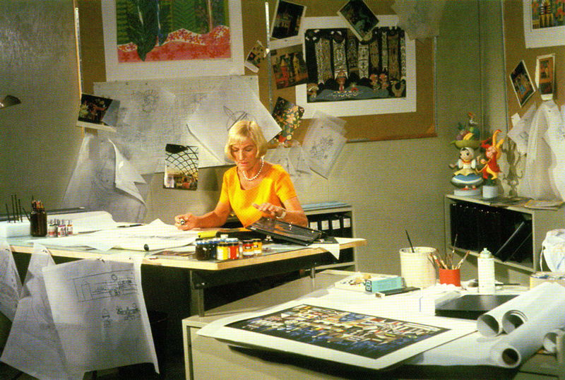
Mary Blair portrait, c. 1963, from The Art and Flair of Mary Blair, Disney Editions 2003
Mary Blair had worked with Walt Disney since the 1940s. Her illustration style introduced a modernist expressive and abstract form to Disney’s projects. The highly stylized forms of Cinderella (1950) are a radical departure from the traditional representation in Snow White and the Seven Dwarfs (1934). For the 1964 New York World’s Fair, Blair worked was a key designer on It’s a Small World for the UNICEF Pavilion sponsored by Pepsi-Cola. Her kinetic and exuberant color palette was paired with forms emulating egg crate paper, glitter, ribbon, and a host of other “craft” materials. Without an architectural background, Blair built the model with these components rather than traditional model-making tools. Her earrings were duplicated on a large scale and used as spires. The result is the logical connection to the subject matter: It is a building that feels as though a child designed it with small scissors and construction paper.
In 1970, Blair was asked to design a series of murals for the Grand Canyon Concourse. Faced with the airplane hangar ambience, Blair addressed the problem with a nine-story ceramic interpretation of the Grand Canyon from the canyon floor to the rim. This is a super-graphic that defies the dictates of simple and massive forms. It is dense, complex, multi-layered, and detailed. Blair’s color sensibilities are apparent. Her forms seem to float and hover above the surface. The colors mix in ways that would be deemed a failure in any first year color class. One of Blair’s talents with color is her refusal to use “simple” tones. The primary colors are skewed on the color wheel. Red is never just red. It is slightly orange or closer to coral. Secondary colors such as green are avocado, chartreuse, or turquoise—never pure green. Blair’s color sensibility is equally evident in How To Succeed In Business Without Really Trying (1967), where she is credited as Color Consultant.
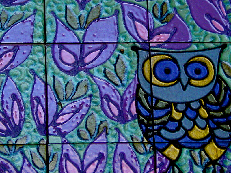
Detail,The Grand Canyon Concourse ceramic mural, 1971. The Contemporary Resort, Walt Disney World. Mary Blair.
While this may appear to be an interesting exercise in color theory, the reality is a massive designed form based on expressionist abstract art and radical color combinations. If this were installed at a gallery or corporate headquarters of a forward thinking company, we would consider it intriguing. But it stands in the lobby of a hotel at the world’s most visited tourist attraction. Millions of visitors see, photograph, and marvel at the details. The design is related more to Willem de Kooning than a Currier and Ives print. Blair’s masterpiece may be the most viewed modernist mural in the world.
Blair’s magnificent forms and the decision to install them are part of a post-war optimism. It comes from a time when American manufacturing and corporations represented a bright future. As Europe and Asia rebuilt after the devastation of World War II, the United States surged forward as the dominant power and manufacturer. By 1971, much of the country was embroiled in cultural wars and racial strife. A certain faction, however, maintained the belief that our best days were still ahead of us—as long as we were committed to the American corporation and new technology. The Grand Canyon Concourse and the Mary Blair mural are one of the last monuments to this idea. With ingenuity and the best thinkers, anything, even a hotel with a monorail and gigantic ceramic super-graphic, was possible.
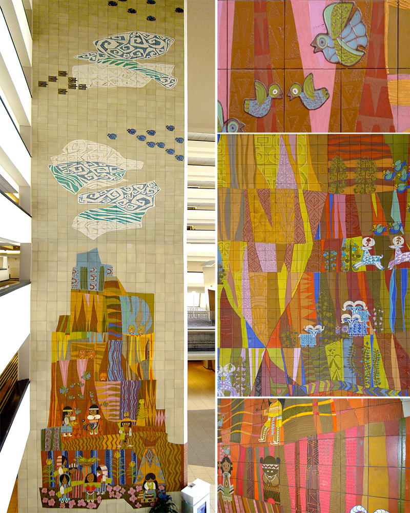
Detail images from The Grand Canyon Concourse ceramic mural, 1971. The Contemporary Resort, Walt Disney World. Mary Blair.
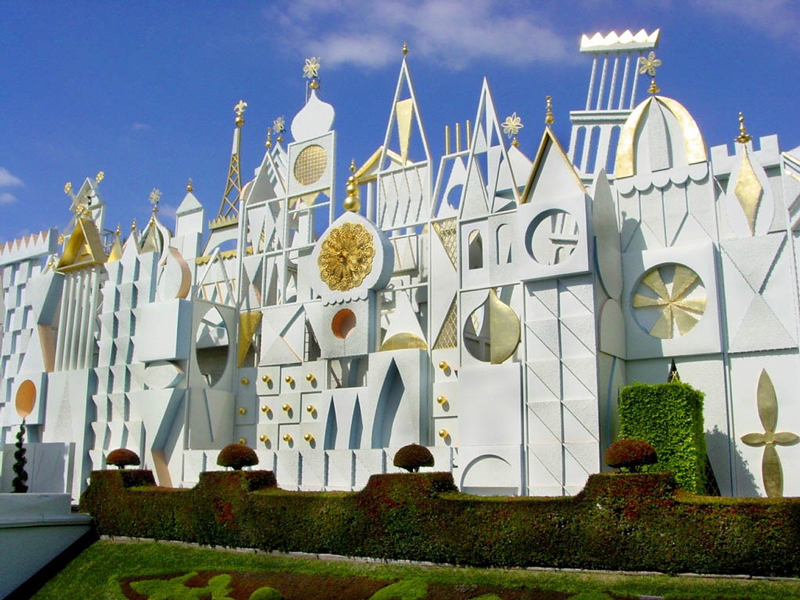
It’s a Small World, 1964. Disneyland. Mary Blair.
