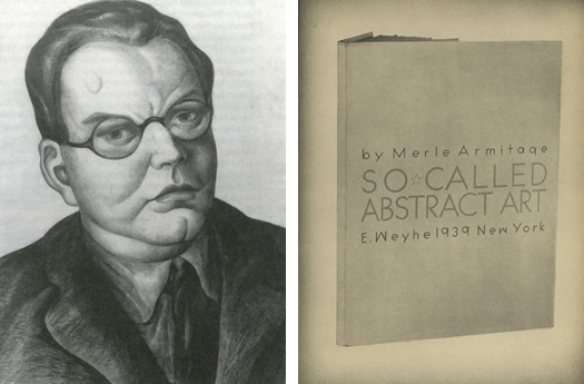
LEFT: Portrait of Merle Armitage by Henrietta Shore, 1933 (from LA’s Early Moderns: Art/Architecture/Photography by permission of Victoria Dailey). RIGHT: Page from Merle Armitage, Notes on Modern Printing,1945, designed by Merle Armitage
This story of a family tree — a nut tree perhaps, but a fertile one — begins with Merle Armitage. Many may know him as a book designer (among the many other significant hats that he wore was that of an impresario) who lived primarily in Southern California from 1923 until his death in 1975. For me, Armitage is the first in the lineage of designers from a certain ilk that rejected tradition, forged their own path, and did it their way. They set about to invent “the new” and in doing so rejected east coast traditions, European conventions, or any kind of sacred schools of art or design, be it traditional or modern. It’s an attitude particularly endemic to California. Why California? I have an “earthquakes, mudslides, fires, and riots” theory: Given that at any moment the terrain — social or physical — might be utterly transformed, Californians can’t count on the status quo. California is, in fact, a moving target that has motivated fresh starts, encouraged making it up as you go along, and turning one’s own personal fantasies and predilections into stunning reality. It is, after all, the “land of opportunity” with vibrant light and weather that affords year-round play. The work of graphic designers that California nourished between a particularly lush period, 1936-1986, might look familiar at first glance, but a second one quickly reveals that this was work that took a conceptual and rebellious left turn. While more vernacular and diverse approaches to design seem common today — even obvious — back in the day of Merle Armitage and nascent American modernism in design, it was more likely to be perceived as oddball. In the case of Armitage and others to follow it was a modernism cooked in the California sun — a sunbaked modernism.
Armitage’s work ranks low on the obscure — plenty has been written about his life — yet ask a graphic design student about him and the likely response will be a blank stare. He was also celebrated for his contributions to modern American book design, but for me existing coverage of his oeuvre as a designer has fallen short in adequately highlighting particular idiosyncrasies and motivations. What gets lost in the drab imagery with which his work has often been represented is a particular wow, pop, and sizzle — the very stuff that characterizes California design and finds its origins in Armitage. What follows are some whys, wherefores, and whats — showing and telling — that characterize both Armitage and modern California graphic design — the seeds that under the left coast sun propagated a garden of delight!
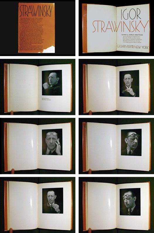
Cover, title page, and six of eight photographic portraits of Igor Stravinsky by Edward Weston from Igor Stravinsky, 1936, edited and designed by Merle Armitage
Forget the rules. Reinvent the motivations.
In a seemingly why-the-hell-not gesture, Armitage opens his book on Stravinsky (Igor Stravinsky) with eight photographic portraits taken by Edward Weston. Pose after pose after pose of “the great maestro” testify to Armitage’s appreciation of Weston as much as of Stravinsky while perhaps simultaneously winking at the notion of the “celebrity portrait” suggested by the hyperbole of images. No conventional single dignified portrait of the artist for this designer, Armitage balked at tradition, a self-described “bad boy of design.” While modernists were all about rejecting tradition and finding new way to be in a modern world, most were just a little more prissy about it. Armitage saw himself rethinking “the book” by rethinking the reading experience — or maybe better put, rethinking the whole experience and function surrounding reading including looking, holding, and engaging on a gamut of different levels. Consider the Stravinsky book cover on which Armitage introduces a polemic about art that seems to also characterize his bravado approach to shaping the book. In Stravinsky’s words as quoted by Armitage: “There is nothing to discuss, or to criticize: one does not criticize anybody or anything that is functioning.” Armitage's intent in the book’s design was parallel to Stravinsky’s intentions as a composer, namely an interest in creating outcomes driven by “what works” rather than the dictates of convention. The dilemma for Armitage was how to imaginatively interrogate Stravinsky’s work. Rather than offering a the final word on his practice, Armitage offers 8 different portraits and 11 diverse critiques — a bouquet of ideas and ways of viewing Stravinski’s work as work of art itself.
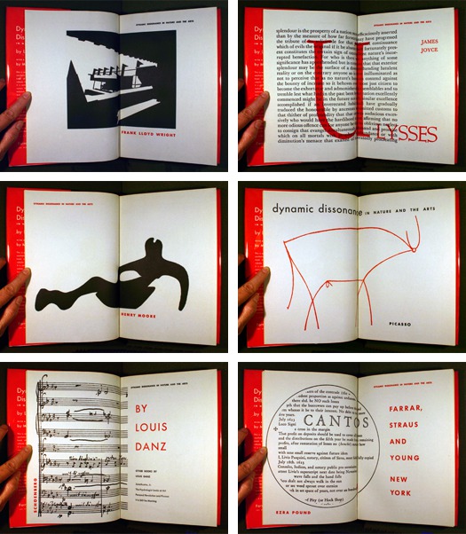
Four of six “title” page spreads from Louis Danz, Dynamic Dissonance in Nature and the Arts, 1952, designed by Merle Armitage
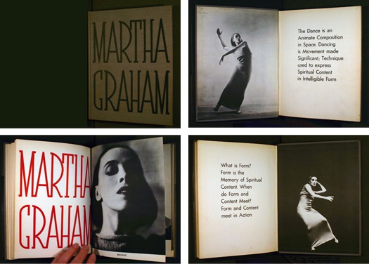
Spreads from Martha Graham, 1937, edited, art directed, and designed by Merle Armitage
Wear many hats at once.
“Granted, a book too difficult to read is useless. But the attitude that printing must serve only the function of readability is like saying that the only function of clothing is to cover nakedness or that the only use of architecture is to provide shelter.”
—Merle Armitage
Assuming a diverse gamut and combination of roles including impresario, publisher, editor, writer, typographer, designer, art director, and/or client depending on the project, Armitage saw words, pictures, typography, printing, binding, paper, and even watermarks, as the languages at his disposal to say what he had to say. It also represented a brave new world (or Wild West) in redefining the nature of expertise. While Armitage certainly had an appreciation for the art of bookmaking and typography, he didn’t let it stop him. One publisher described him as a “a bull in a china shop” and then went further to suggest that his approach to books was “original and startling and fresh and often disturbing. He follows no traditions. It is possible he doesn’t know the traditions.”
In one example —Louis Danz’s Dynamic Dissonance in Nature and the Arts — the tradition in book design would have meant more predictable roles for both designer and for title page. Although Armitage didn’t pen Dynamic Dissonance, he did help Danz to expertly introduce the book’s vocabulary of dissonance by employing multiple title pages as a visual essay. Another possibility was that he was mimicking the narrative qualities of film, utilizing the multiple title pages to create a backstory to the book’s main content — an approach to title design that also significantly enhanced film-making not recognized until the film title contributions of Saul Bass and Pablo Ferro decades down the pike.
For Martha Graham a book Armitage edited, designed, and art directed it required unconstrained latitudes of professional boundaries to conceive a visual and verbal language that would reflect Graham’s new grammer of movement. Meeting the challenge for Armitage meant choreographing the marriage of “form and content” with bold starkness and an active punch of words and the gesture of photos set to rhythmic typography.
Pages and detail from Merle Armitage, Notes on Modern Printing,1945, designed by Merle Armitage
Don’t take it too seriously. Embrace whimsy. Be mischievous. Laugh.
With so much sun ‘n fun, new horizons, less establishment, wild west, mystical, magical, majestic, challenging, and all the other California tropes and clichés one could muster: How could anyone get too serious in a place like this? Unless utilized for political commentary, such as that in the work of the Dadaists or montagists such as John Heartfield, modernism and humor has not been a common coupling. I doubt they ever were good friends until they met on the level playing field of California.
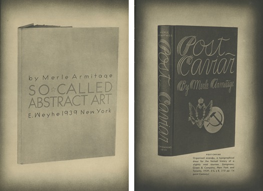
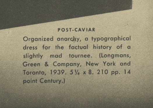
Titles of documents conceived by Armitage such as So-Called Abstract Art and Post-Caviar belie his unwillingness to tread the humorless path. Any uncertainty about Armitage’s intentions as suggested by his title choices is quickly squelched in the caption he provides for Post-Caviar in his booklet on his approach to design, Notes on Modern Printing — “Organized anarchy, a typographical dress for the factual history of a slightly mad tourneé.” Whether dealing with captions, book titles, writing, or design, Armitage’s voice was witty, sardonic, and sly. The work loudly and laughingly embraces fun as hedonistic pleasure, employing a sense of delight and adventure over certainty and constraint.
Pages and detail from Edward Bellamy, Looking Backward, special edition by The Limited Editions Club, 1941, de- signed by Merle Armitage with illustra- tions by Elise.
Fantasize Fantastically.
Fantasy as a distinct quality of California graphic design seems befitting given that the place’s very concept was born of the imagination. In 1510, Spanish writer Garci Ordónex de Montalvo penned Las Sergas de Esplandián (The Deeds of Esplandián) and thus the legend was born. What was to become known as California was described in Motavalo’s tale as an island somewhere to the right of the Indies inhabited by “a race of black Amazons under the command of Queen Calafia.” Montavalo, in the words of California’s prolific historian, Kevin Starr, goes on to describe California as “abounding in gold and precious stones” where the natives ride “griffins into battle and fight... with gold weapons.” The adventurous Queen Califia, according to Montavalo was “most beautiful... desirous of achieving great things, strong of limb and of great courage.” In 1533 the Spanish explorer Hernán Cortéz discovers the land that he believes to be the actual locale elaborated in the fictional tale and thus California becomes an actual place.
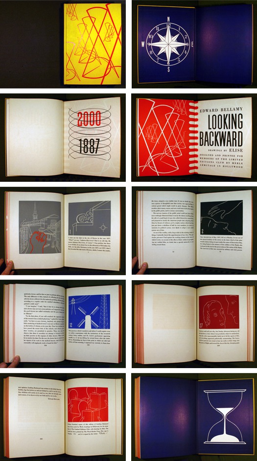
Imaginative teller of visual tales, in 1940 Armitage is commissioned by the Limited Editions Club to interpret Edward Bellamy’s Looking Backward. In a fantastical leap of graphic production Armitage imagines what books might look like in the year 2000 — an interpretation that included a shocking yellow cover in new material by DuPont that was both “washable and vermin-proof,” vividly colored abstract illustrations by one of Armitage’s many creative paramours that became a spouse, in this case, Elise (Cavanna), and special papers that included a custom watermark. He even had a slipcase made of Plastacele — an early clear plastic that was quite expensive at the time.
LEFT: Ad for performance by Rosa Ponselle, 1923, written and designed by Merle Armitage as it appeared in Notes on Modern Printing, 1945, designed by Merle Armitage. RIGHT: Detail of spread from A Smile at the Foot of the Ladder by Henry Miller, 1948. Published and designed by Merle Armitage
Lay back and enjoy the scenery.
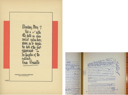
Contemporaries regarded Armitage’s approach to typography as awkward. He tended towards the large and graphic especially when employing type for covers and title pages, refusing to see type as the pristine and transparent carrier of author’s intentions, approaching it instead as alphabetic performance artist. Armitage was, after all, an impresario — a cultivator and promoter of talent — and even did a stint in advertising Packard automobiles. Whether working with an opera singer, an ad, or a book, he sought out and then exploited and cultivated opportunity. An ad for Rosa Ponselle, an artist that Armitage represented, is a graphic effort that through its laid-back attitude sought to overcome a perception that some of his performers were “hand-maidens of genteel women’s club activities.” Armitage wanted to build audiences that were diverse and thus had to convey a point of view that suggested “informality” in contrast to the fusty, serious approaches to advertising that convey “the dullness essential to any sort of snobbery.” As he put it to the California Art Club in 1929 “Arriving in California from New York, I was appalled by the anemic, colorless art being produced in the remote and provincial Los Angeles area. Moral, social, and sentimental values were utterly confused with aesthetic values.”
In 1948, Armitage bought the publishing rights for a work by the very man who dug the dirt of crusty narratives in his landmark tell-all of sex and debauchery, Tropic of Cancer — Henry Miller. For Miller’s short story, A Smile at the Foot of the Ladder, Armitage seems to have decided that the craft of writing was an equally compelling tale as the intended story and thus reproduced the typewritten manuscript with Miller’s hand-written edits intact along with a meandering performance of clown and circus images — many from Armitage’s personal collection including Picasso, Klee, and Chagall — all enclosed in a tent of red and white striped end papers.
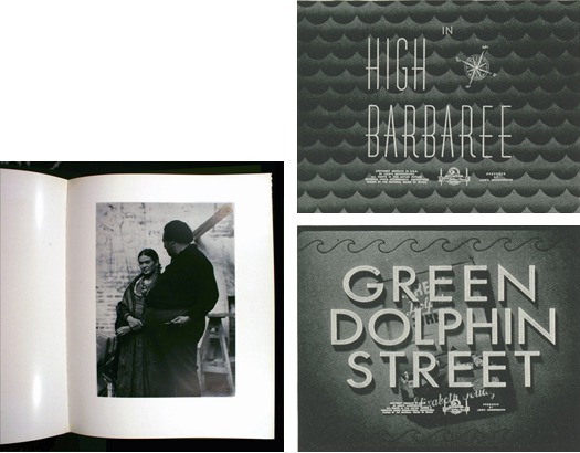
LEFT: Edward Weston, 1932. Designed by Merle Armitage. RIGHT: Movie titles designed by Merle Armitage for “High Barbabee” and “Green Street Dolphin,” undated but likely were produced in 1947. Scans from Merle Armitage, “Movie Titles,” Print, Volume V: No. 2, 1947
Push Technology. Better yet, play leapfrog.
The anecdote that Merle seemed to relish about his book Edward Weston was that of a mysterious pressman who came to the rescue of reproducing Weston’s photos by setting fire to the printing plates. This brief and highly unorthodox torching resulted in the luscious photographic reproductions with full tonal range from rich blacks to lustrous grays and sharp whites. These were qualities on which the book depended if it was to come close to the quality of the original photographic printing and not succumb to the low industrial printing that dominated at the time — essential if the book was to succeed in arguing photography as art and not just functional technical reproductions of “reality.”
Armitage also designed movie titles hoping to move the Hollywood industry forward in the embrace of new opportunities for film openings following the demise of the silent film era and the need for dialog cards. He explored what to do with the titles as well as who would be responsible for them beyond “early nineteenth century bric-a-brac, or rococo fantasies of purest corn serene” as Armitage pejoratively described the approach to titles. In other words, Armitage questioned what titles might be if created from a modern typographic and design approach and at the same time meeting the legal requirements of actors’ and producers’ billing order.
These efforts suggest the symbiosis of technological advancement with that of the flourishing of design — one suggesting opportunities for the other.
The nuts fall close to the tree.
The California grove that grew from the seeds of Armitage realized all sorts of strange and wonderful sunbaked modernisms finally bearing new fruit in postmodernism — a genealogy too complicated to chart here. This work ranges far and wide — from the weird but charming Disneyland posters that wrangled gothic type and cartoons into modern compositions to April Greiman’s transplanted Swiss International style. Her work was imbued with a west coast palette and new wave attitude along with her loving embrace of video and computer technology resulted in an iconoclastic aesthetic.
Among this flora is also found the imaginative repurposing of type case furniture, rules, and ornaments by Alvin Lustig and the artful fine printer, Ward Ritchie, in a collaboration that resulted in experimental graphic illustrations for The Ghost in the Underblows. Off that straight and narrow modern path heads towards the oft-claimed Art Nouveau-inspired psychedelic posters of the 1960s. Along the way are the fantastical concoctions that borrowed liberally from the bold modern design of the twentieth century combining odd cut shapes, optical patterns, and striking non-fluorescent colors into a kind of “hippie modernism” found in the DIY graphic production of Nicholas Sidjakov, Hetty McGee, and Tom Weller. At the same Sister Corita Kent crafted her own version of Pop-inspired graphics that freely mixed ecclesiastical and gentle political musings with found fragments of pop culture typography and language, throwing out the graphic baby with the modernist (holy) water.
As mentioned earlier, beginning in the early '60s Saul Bass and later Pablo Ferro helped reinvent approaches to film titles, transforming one important aspect of Hollywood industry that was only tentatively occupied by graphic design thus inflecting it with contributions that came closer to film direction. Meanwhile artists like Bruce Connor and Harry Smith forged crazy, wonderful, delicious approaches to motion graphics and shaped early music videos. The range of work produced by these varied talents spoke to the evolution of the Hollywood film industry on the one hand and the development of independent experimentation in the lineage of modern graphic animators such California-cultivated Oscar Fischinger and John Whitney on the other.
Marget Larsen was one of many California Girls who ushered in a graphic revolution heard ‘round the world. In the 1970s Larsen conceived loud and inventive approaches to advertising and promotion for Joseph Magnin department stores, while her mightily influential design sisters such as Deborah Sussman, Barbara Stauffacher Solomon, Sheila Levrant de Bretteville, Frances Butler, Lorraine Wild, April Greiman, and Zuzanna Licko strong-armed modernism into more pliable shapes. De Bretteville corrupted the cool rationalist tropes of modernism by reclothing them in lowbrow materials. Butler adopted a variety of hats, including becoming a publisher, designer, and printer, who along with Alistair Johnson, explored the physical and material limits of the book, while interrogating the conventions of late modernism and the limits of graphic design. Wild followed Armitage’s lead in book design by asking what the content wanted to be rather than wrapping it in a predetermined style, or in the imitable words of the Maestro, she “let the punishment fit the crime.”
Cultivated in the fertile California soil laden with the sludge, slurry, and manure of curiosity and imagination, freed from the past and tilled by the bravado likes of Merle Armitage and others, it’s amazing what a sunbaked Modernism grew.
Bibliography
Victoria Dailey, From Z-A: Jake Zeitlin, Merle Armitage & Los Angeles’ Early Moderns (UCLA Library: Los Angeles, 2006)
Victoria Dailey, Natalie Shivers, Michael Dawson, LA’s Early Moderns: Art / Architecture / Photography (Balcony Press: Los Angeles, 2003)
Merle Armitage, Accent on Life, (The Iowa State University Press: Ames, 1965)
Ward Ritchie, Of Bookmen & Printers, (Dawson’s Book Shop: Los Angeles., 1989)
Merle Armitage, “Movie Titles,” Print, Volume V: No. 2, 1947
Merle Armitage, Notes on Modern Printing, (Rudge: New York, 1945)
Roy R. Behrens, “A Tribute to Merle Armitage (1893-1975): Iowa-born book designer” http://www.bobolinkbooks.com/DesignHist/Armitage.html
Ward Ritchie, Of Bookmen and Printers: A Gathering of Memories (Dawson’s Book Shop: Los Angeles, 1989
Ramiel McGhee, 23 Books Designed by Merle Armitage, (E. Weyhe Publisher: New York, 1938)
