
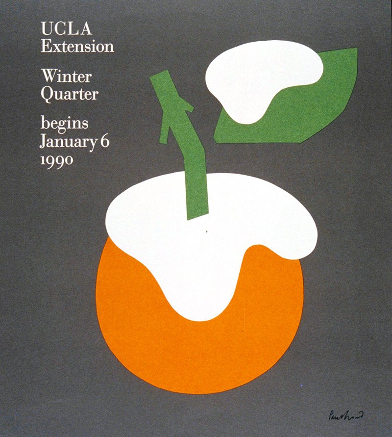
While this approach will provide a clear illustration of the idea, it rarely engages the viewer beyond the cursory understanding, “That is Paris and flowers.” Alternatively, symbols and iconography create mnemonic value, one of the goals of communication. A symbol on a poster, perhaps an orange, is presented to the viewer. In the context of a poster for Los Angeles, this creates a dilemma. Is this a representation of an orange or is that a description of southern California? The time to make this determination creates an intimacy with the communication and mnemonic value. But, this can be elevated to create a deeper and more compelling solution.
Paul Rand, UCLA Extension cover, 1989
Paul Rand, Kauffman’s Deaprtment Store, 1947
Paul Rand, Modern Art in Your Life, 1949
This conceptual approach of the “fused metaphor” combines symbol “A” with symbol “B” to produce a new result. Abstract white shapes sit on top of the orange forms. The viewer now is required to determine: what does the orange mean? What do the white shapes represent? The answer is winter in Los Angeles. Each shape by itself has one meaning. Combined, they create a new communication. The viewer has the visceral pleasure of solving the puzzle and remembers the solution.
Louis Danziger, American Paintings from the Metropolitan Museum of Art, 1966
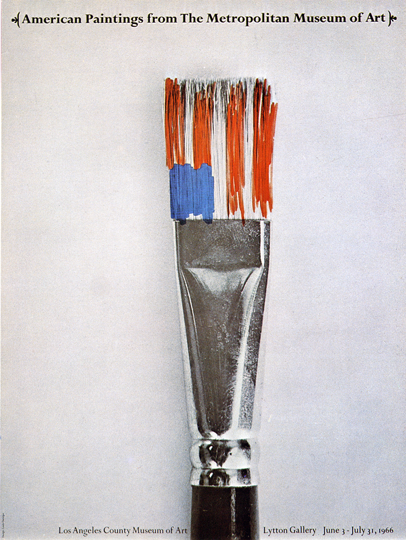
Lou Danziger’s cover for American Paintings from The Metropolitan Museum of Art (1966) is a stellar example of the fused metaphor approach. A black and white paintbrush is combined with an American flag to pair the two ideas. By itself, this is a valid concept. But, Danziger enhances the idea with the execution. The black and white brush is on a white background. We are not distracted by unnecessary questions: what is that surface, or odd color of the handle? The typography allows the idea to take “center stage.” The flag, surprisingly, is not a flag. There are no stars and only seven stripes. In fact, the shape is simply a loosely painted combination of colors. We are challenged to define this rough sketch as the flag, again, creating more intimacy with the cover. The form of the flag made with brush strokes relates to the subject matter.
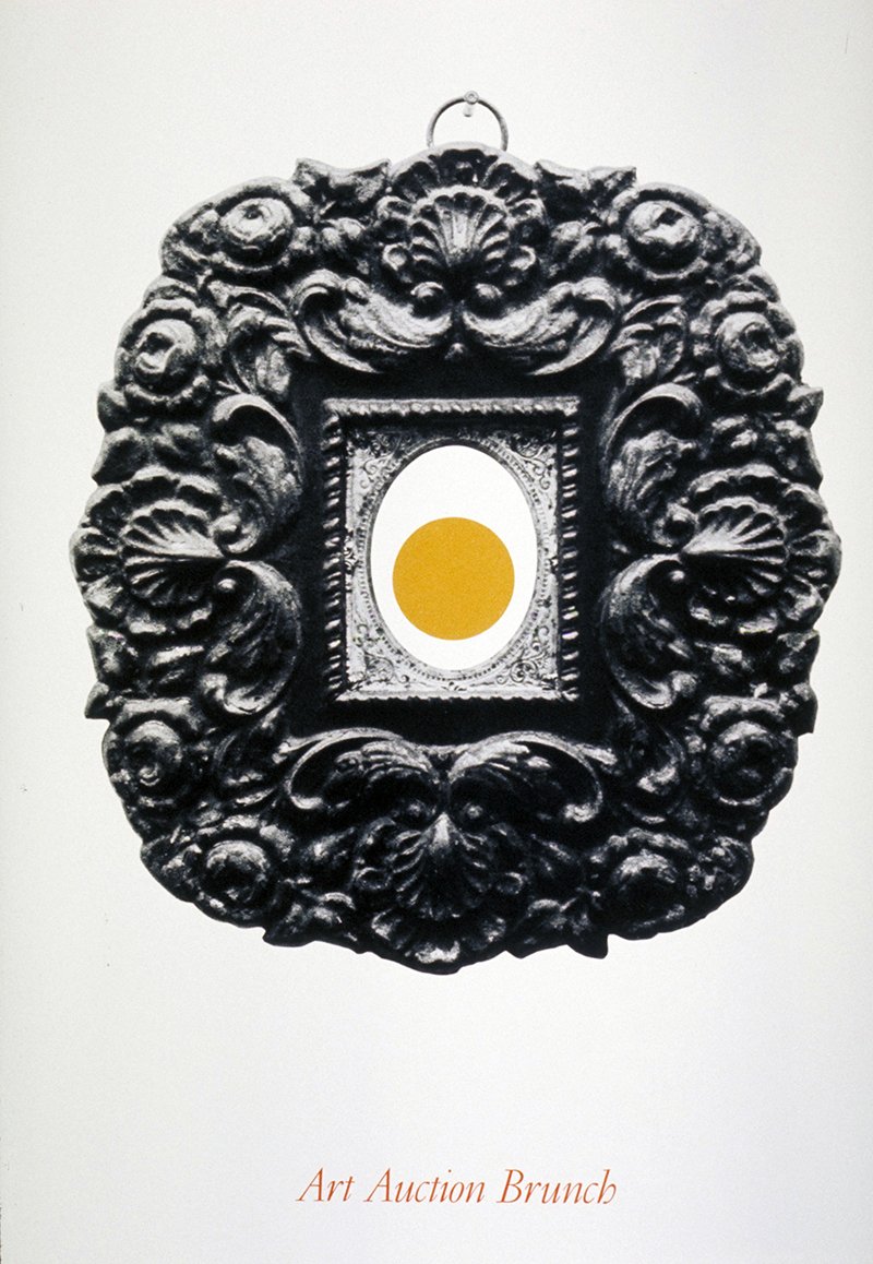
George Tscherny, Art Auction Brunch, 1970
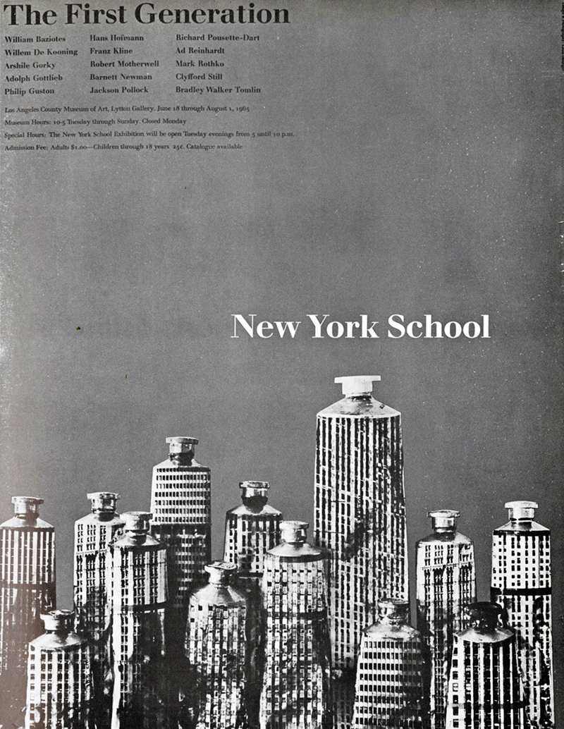
Louis Danziger, New York School, 1965
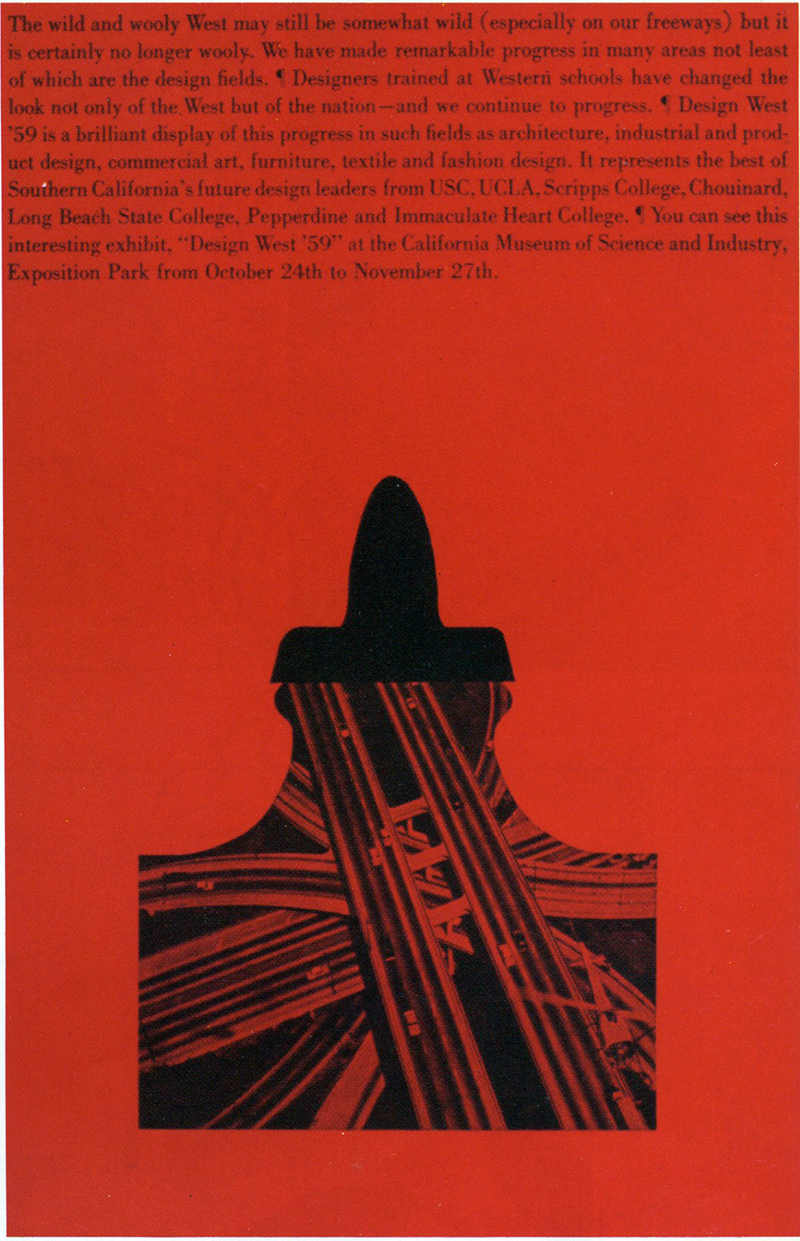
Louis Danziger, Design West, 1959
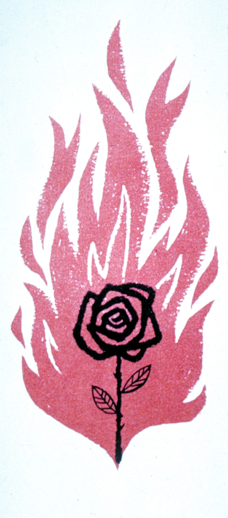
Saul Bass, Carmen Jones, 1955
The process of design with the fused metaphor approach relies on our knowledge of symbols, and understanding of the intended audience. The more particular the symbol is to that audience, the more resonant it will be. Determining the appropriate symbol taps into a part of our brain not related to visual form.
The assignment is a poster for The New York School of Painting. The designer writes a list of symbols for New York: an apple, skyline, Empire State Building, Statue of Liberty, etc.. Then lists symbols for painting: paintbrush, paint tubes, canvas, a wood palette. One symbol combines with another: a roughly painted apple, the skyline made of paint tubes, the Statue of Liberty cut from painted canvas, and so on.
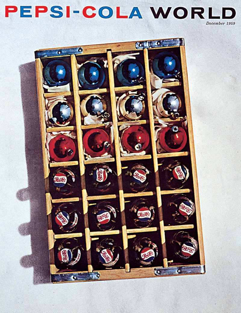
Brownjohn, Chermayeff, and Geismar, Pepsi Cola World, 1959
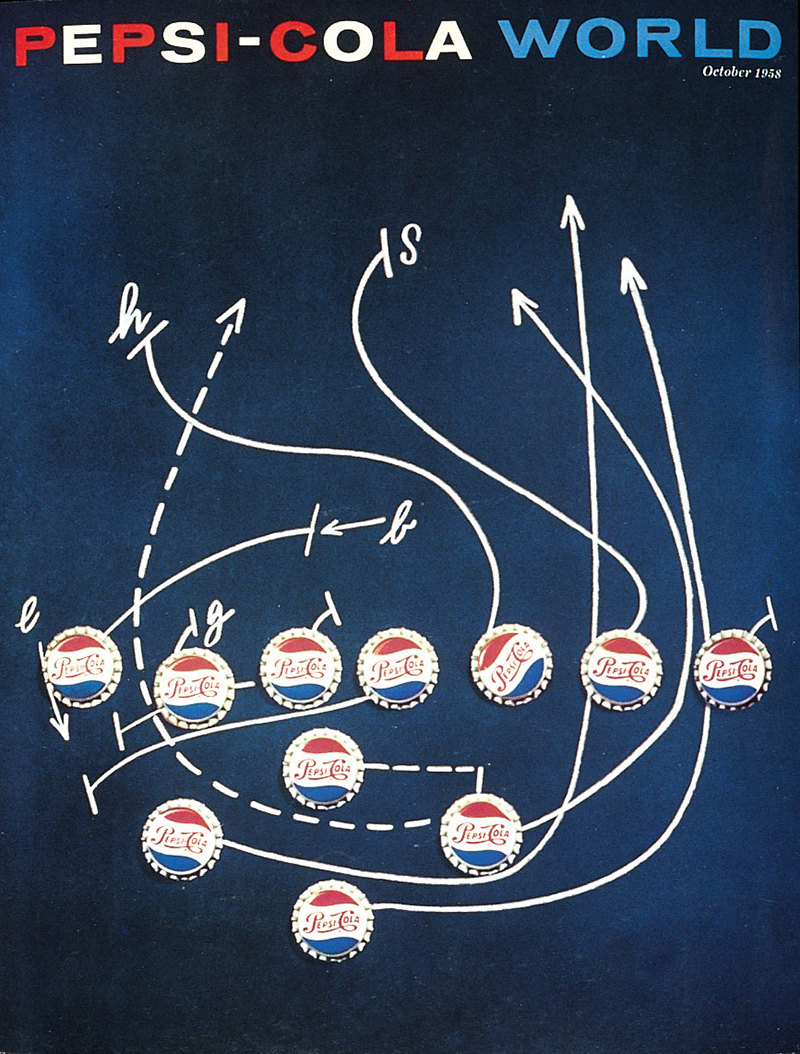
Brownjohn, Chermayeff, and Geismar, Pepsi Cola World, 1958
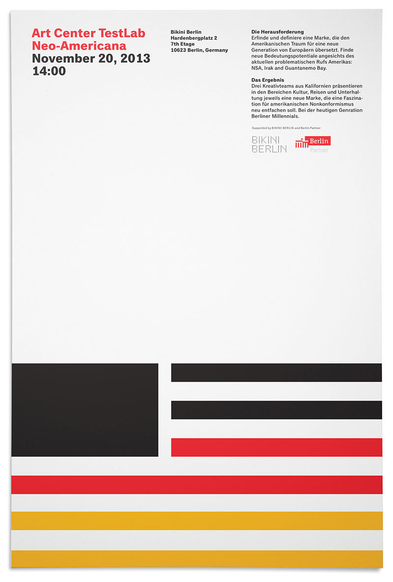
Sean Adams, ArtCenter Berlin: Neo-Americana, 2013
The solutions are products of modernism. The designer eliminates unnecessary elements. The process is iterative, relying on scientific logic. There is no attempt to disguise the media: a painting is a painting, a crate of bottles is a crate of bottles. While some solutions may seem quaint or nostalgic, these approached the audience with respect. Rather than presenting scenes that are simply documents of a place and time, or worse, meaningless settings with floating heads, there is a presumption that the viewer is intelligent and can recognize the symbolism and iconography.
