Promotional image from Pan Am, an ABC series that first aired in 2011.
In 2003, UPS replaced the Paul Rand logo with a new version designed by FutureBrand. There was an immediate outcry from much of the design world lamenting the loss of the treasured Rand logo with the bow. At one point, it was suggested that a logo should have the same protections as a building under the National Historic Preservation Act of 1966. While this appealed to many designers, it was a doomed concept. Forbidding a corporation from managing their brand is just plain stupid.

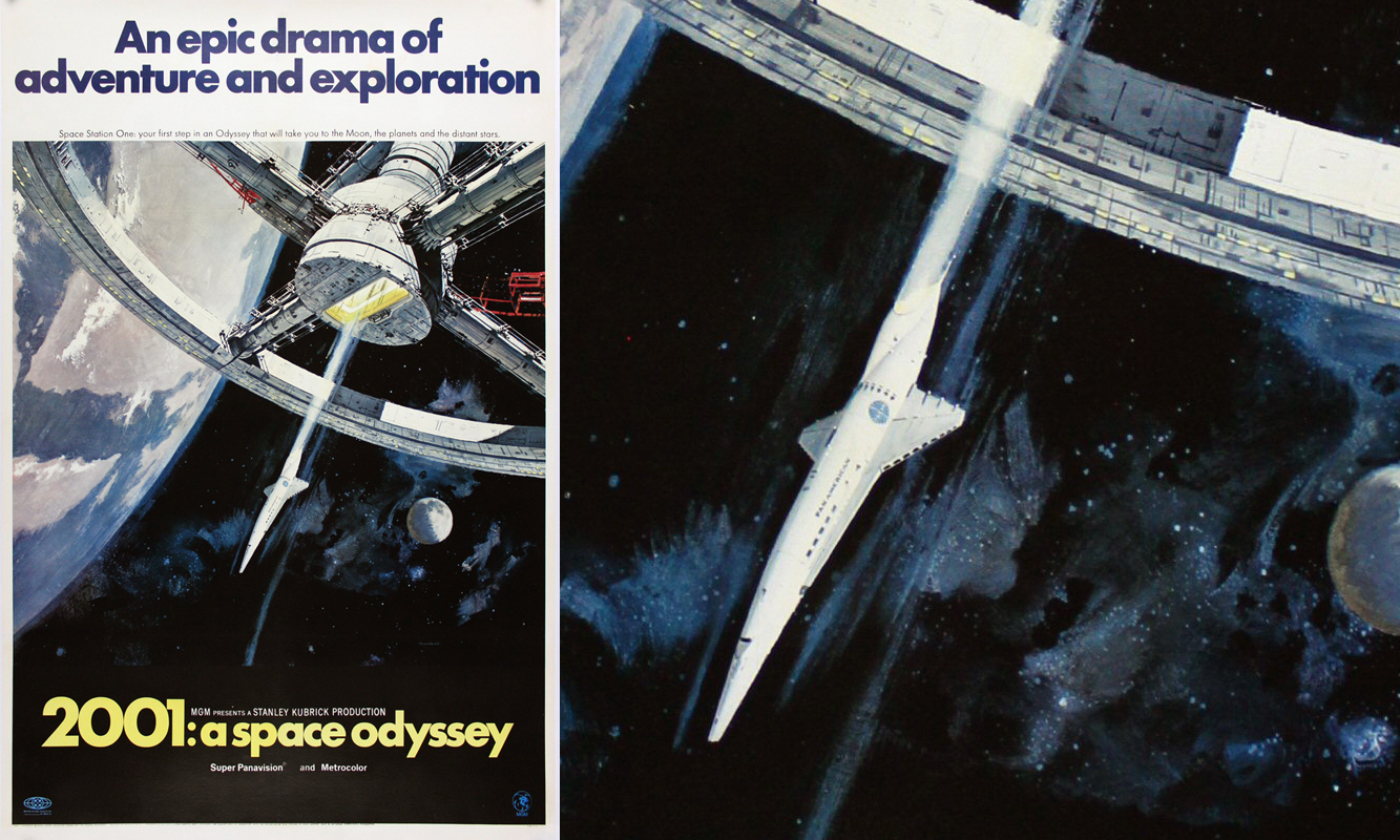
2001: A Space Oddesy poster, featuring a Pan Am Orion III
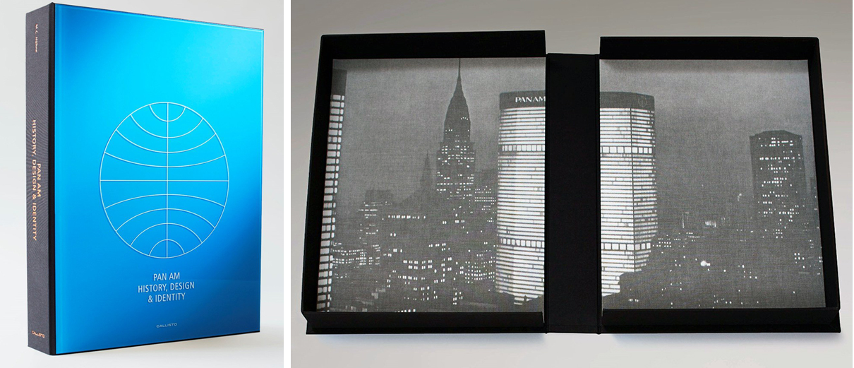
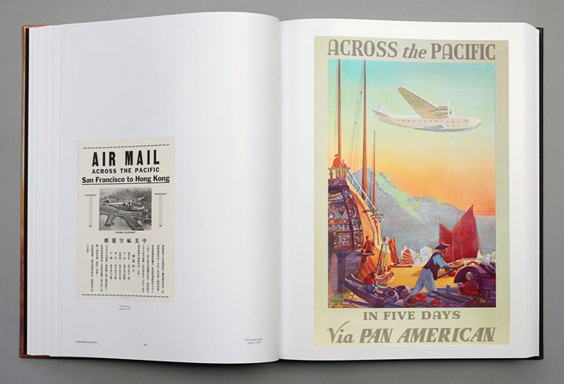
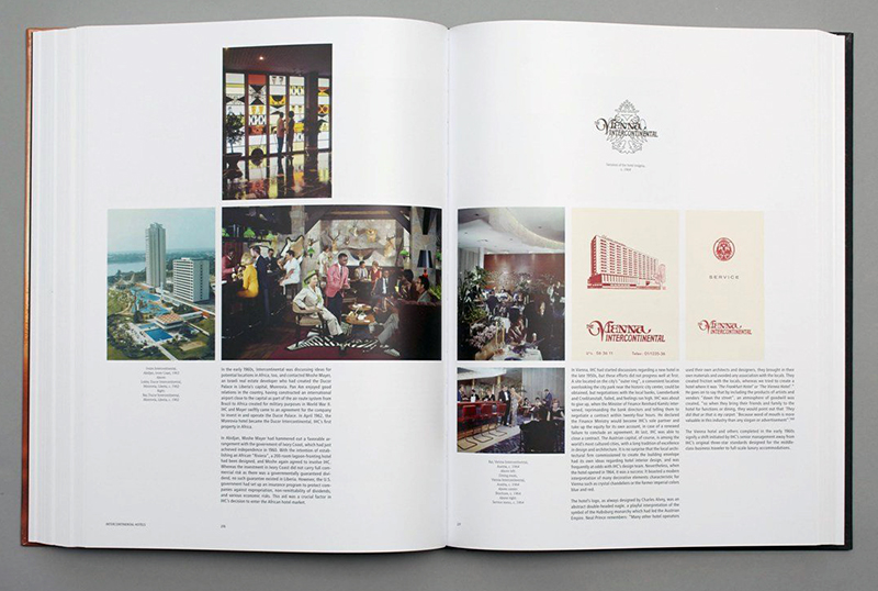
What is interesting here, is the emotional connection for a graphic identity. Matthias Huhne’s new book, Pan Am: History, Design, & Identity, is evidence of this. Huhne tells the story of the world’s largest airline for much of the 20th century with images, printed artifacts, and the Pan Am identity. From the Pan Am Orion III spaceplane from the movie 2001: A Space Odyssey that represents the promise of a bright future to the Pan Am television series from 2011, the identity still resonates.
VIEW PAN AM TIMELINE 
Pan Am: History, Design & Identity by Matthias C. Huhne, published by Callisto Publishers. The standard edition was published in November 2016, the premium edition goes on sale next week..

Pan Am: History, Design & Identity by Matthias C. Huhne, published by Callisto Publishers. The standard edition was published in November 2016, the premium edition goes on sale next week..

Image courtesy of Callisto Publishers.

Image courtesy of Callisto Publishers.
 Image courtesy of Callisto Publishers.