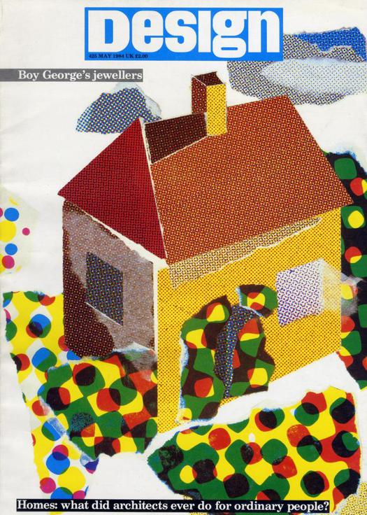
Design no. 425, May 1984. Design by Keith Ablitt. Illustration by Nancy Slonims
I found this old copy of Design magazine in my attic, in a big stash of magazines that I have finally decided, with a born collector’s reluctance after years of hoarding them, to send on their way. The more immediately useful stuff is closer to hand and the rest was gathering dust out of sight. This one salvaged copy I shall keep, though. It comes from a period — the early to mid-1980s — when I was passionate about magazines and increasingly fascinated by all forms of design, though I had yet to start writing about the subject. The issue has a great cover, it’s highly representative of its era, art editor Keith Ablitt’s design is rather good, and John Thackara, my Observers Room colleague, was then the editor.
This, and some of my other design magazines from the 1980s and early 1990s, did give me pause for thought. Design, published for several decades by Britain’s Design Council, is long gone. It disappeared from the newsstands and then came and went in unsatisfactory incarnations aimed at signed-up insiders — a mighty fall from being the country’s design journal of record freely available to all-comers in the shops. Just a few days before I went rummaging in my attic, Britain’s Design Week published its final issue after 25 years; Lynda Relph-Knight, for an astonishing 22 years its editor, has departed. Design Week will continue to publish online, with at least some of its content hidden behind a paywall. I used to look at DW fairly regularly, though it’s a long time since I bought a copy, but I won’t be following it online and I imagine it will now drift off the radar of many other occasional browsers.
Let’s not forget, too, that it’s not long since I.D., America’s once great design title, also folded. The recent rebirth of the I.D. “brand” as a gallery “powered by” Behance Network is emphatically not a replacement. One thing people tend to say about defunct and, it often seems, little lamented magazines is that they had become redundant because the information is available elsewhere online at no cost (to them, anyway).
Well, it depends what we mean by information. Pictures — yes. Press release-like blurbs — no argument there. And fleeting tweets aplenty. But if you are a student, with access to a good design-school or college library, try digging out some old issues of Design or I.D. from 20, 30 or 50 years ago. Sample the range, expertise and quality of the writing. My issue of Design from 1984 has analysis of six kinds of housing (the cover story) with some highly revealing, almost anthropological pictures of ordinary people in their homes; close critical readings of a soda-maker, a washing machine, a saloon car and a kitchen mixer; and a skeptical assessment of shopping mall design — “stagey sci-fi and nostalgic whimsy” — by Peter Dormer, a fine critic, who died too young. Assistant editor Jeremy Myerson, who went on to start Design Week (he’s now director of the Helen Hamlyn Centre at the Royal College of Art), writes about mass-market furniture design. And there is plenty more.
If you wanted to be this well informed about your industry now, where would you find present-day, regular, thoroughly sourced investigations equivalent to those delivered by these design publications, in Britain or the United States? (I’m not talking about titles that are primarily about architecture.) These magazines provided properly researched, decently funded professional journalism produced by well-qualified writers and editors with a full-time commitment to the task. The detail and accuracy of the reporting makes publications such as these invaluable time machines for anyone now engaged in historical research.
The new design writing and criticism courses at SVA, RCA and LCC are doing a fine job of attracting students in an unfavorable economic climate, but maybe more emphasis needs to be put on fundamental skills of reporting and a broadly based and sustained, rather than a desultory and hyper-personal, engagement with design. Without high-quality, properly resourced design journalism as bedrock and training ground, I can’t help but wonder how — and even more to the point where — this new “higher-level” criticism is going to emerge. The continuing closure of print publications without equally auspicious online platforms to replace them is not a good sign.
So let’s hope for renewal. Last week I did, in fact, see a new publication, issue 0 of a critical design magazine with the boldly acerbic, though admittedly slightly off-putting title That New Design Smell. The magazine, divided between web and print, is conceived and edited by Michèle Champagne, an ambitious Canadian MFA graduate from the Sandberg Institute in Amsterdam, with a crisp, “flight attendant” persona — her tutors’ words, not mine — and a nicely cultivated sense of irony. Her aim, she says, is to encourage dialogue, not monologue, by folding comments made online back into the printed version of the magazine. In an amusing video on Vimeo, Champagne locks horns with “lame designer lingo.” And, sorry Design Observer readers, but she has also composed a witty illustration — we used to say deconstruction — of the language of adoration used in many of your comments. The website gives a little taste (or is that sniff?) but you really need to see the whole thing on page with all that positivity amplified in big type. You may never gush again.
