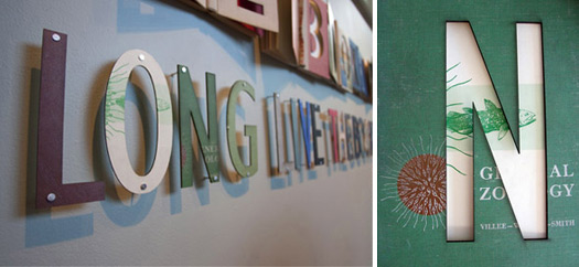
The title wall, designed by Kelley McClure, uses typography lasercut from unwanted books
I shouldn't be reading this book — I shouldn't even be touching it. It is a fragile copy of Oliver Twist from 1841, printed only three years after it was written. Dickens himself might have held it. The pages are paper-towel thick and velvety soft. The typography makes an impression, both literally and figuratively. Tissue protects its many engravings — elaborate scenes of beatings — to ironically save them from injury. To read the text is to time-travel. One gains insight into grammar from the past: "To-morrow" is hyphenated in the annals of yesteryear. Colons : surrounded on either side by spaces : are used unfamiliarly : as in parenthetical thought. Every eighth page is numbered — possibly to track signatures. The contemporary mind fills with intrigue and wonder.
And where did I find such a treasure? Quite conveniently, right in the stacks. The library at North Carolina State University, like it is at many Universities, is laden with gold. Books that seem "rare" or simply too special for public shelving have been, in my mind, erroneously stacked and "dewey decimaled"[1].
And what can these books teach us about design? Let me rephrase that: what can't they teach us about design? Inspiring page layout; unusual language; informative content; unrecognizable typefaces; unfamiliar color palettes; styles of illustration that have long been forgotten; historical connections; echoes from designers that — products of their own time — we couldn't possibly recreate. It is cognitive overload. Reading these books is way better than an e-book. As Steven Heller noted:
"Design cannot be underestimated. A book that is merely composed according to a template, rather than with forethought and imagination, may be adequate for reading yet lacks the quality that makes savoring a book a complete experience."

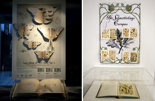
How can surface design further enrich the experience of looking at a book on display? Both posters above engage the reader to interact with the showcased spread; both designs are 3-dimensional, using laser-cut paper. The right image, designed by Meghan O'Brien, uses a standard-format bonnet; the left image, designed by Griffin Friedman, uses a made-to-fit bonnet

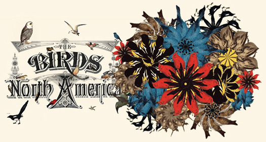
Susannah Brinkley selected the book Studer’s Popular Ornithology: Birds of North America. Her reinvented title page, left, imagines what the title would look like if alive with birds; image-making exploration is seen on the right
These books are complete experiences. And they should be exhumed and exhibited — an initiative that prompted a class called "The Library: A Museum". To exhibit such special collections, our class asked many questions: If a typical exhibition of rare books is under glass — no touching allowed — then how can our audience "experience" a book without being able to feel it, read it or turn its pages? How can we graphically or typographically transform library environments? How can we reinvent the display case or rethink a labeling system to promote connectivity and curiosity? How can we enrich and honor the reading experience?
Each student (of 16 total) found a book that they felt deserving of recognition. Some were rare, others were not — but all were inspired. Our discipline turned interdisciplinary. I was no longer the solo teacher, but joined by 16 authors and 16 publication designers. Their books taught my students — and taught them to be better designers.
James Burke, in his 1978 series Connections, suggests that our lives are "the extension of the production line." He continues that the manufacturing system "helps to give us all the same possessions" because it is "made by people doing identical things with identical machines." When working on the computer, I've witnessed students doing identical things with identical applications, sitting in identical positions, printing to identical printers and sadly, making identical work.
Fortunately, each library book is different. And each library book was made differently. Exposing students to these variations promotes variation in their methods and solutions. They tend to be open to new illustration styles, or typefaces, or production methods. They tend to question their tendencies. Inventive solutions prevail: an exhibit label for a science textbook was laser-cut from a leaf; a poster used light — not ink — to describe form; real tobacco insects adorned a flat illustration of flowers.

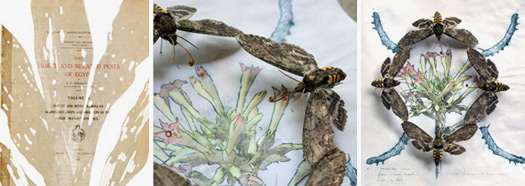
Book design inspires new methods of working. Riley Huston selected the book Insects and Related Pests of Egypt which triggered an insect-eaten title page, left, and a speculative field guide that combined actual insects with hand-drawn illustrations, middle and right
Is this a forward-thinking class? Instead of library books, should we have been designing for the digital realm and cleverly redesigning the e-book? Unfortunately, as John Dewey once noted, people "think in terms of extreme opposites... either-ors." Print is dead because digital technology lives. As one gains in popularity, the other must diminish. Yet in reality, quite the opposite happens: when the book (as artifact) recedes, those remaining are more revered. Our end of the semester exhibition was fittingly called "The book is dead; long live the book." What printed books can't do — hyperlink, embed themselves with sound and video, be quickly searchable, answer questions — we tried to account for in the exhibit. We used digital technologies (exhibit labels viewed on a mobile devices, video projections, etc.) to extend the experience. That was the ultimate goal. It is not a binary duel between the hardcover and e-book: it is a symbiotic relationship.
I wonder if Oliver was given the last name Twist because of the surprise plot? The penniless really is plentiful. The library is free yet has rich offerings. If you're a student of design, visit the stacks often and seek out that orphaned book, that hidden gem. Read it. Experience it. Cherish it. Its lessons are invaluable. And in a world of the indistinguishable, the future of design may be something culled from the past, where offerings were vastly distinguishable and distinguished. Hunger for that difference. And upon its finish, you'll be compelled to request, never minding the severity of punishment, "Please sir, I want some more."
1. The Dewey Decimal system has given way to the Library of Congress system.
