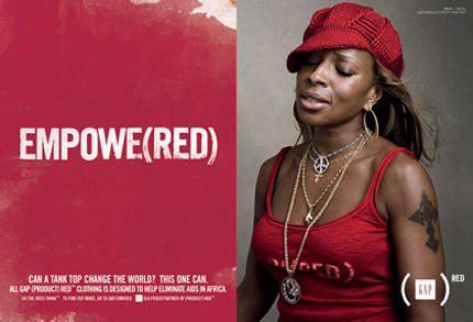
Buy a tank top. Save Africa
"It’s so terribly trendy to care about the poor, the environment, and every form of 'betterment' that I begin to assume we must be selling more design by fetishizing social relevance." — David Stairs, Arguing with Success
I want to believe that the work I do matters. I think we all do.
When people ask me about it, though, I usually deflect: "I'm a graphic designer. What do you do? Are you still in school?" I find it incredibly hard to admit that I'm trying to make a career out of designing for social causes. At best, it sounds naive; at worst, self-indulgent and arrogant.
I don't blame David Stairs for his cynicism. We live in an age where buzzwords like "change" or "sustainability" are thrown around without proper explanation or context. We are constantly bombarded with images telling us that children in the developing world need us to save them. A dollar a day is all it takes. It's no wonder, then, that many designers — young and old — equate designing for causes with the bolstering of a sense of personal legitimacy.
I don't think there is anything inherently problematic with making causes accessible through graphic design. I wouldn't be in this business otherwise. There is a danger, however, to applying the logic of brand identity to social justice. Consumers buying a (RED) iPod or tank top may know that a percentage of their purchase goes to charity, but they can seldom name the actual cause that their dollars support. Though the media attention that Bono and others bring to humanitarian causes is laudable, the message they are sending hides behind a veneer of feel-good consumerism. Buy a latte at Starbucks, and you've somehow saved all of Africa from AIDS.
Furthermore, the tendency to homogenize Africa is reinforced by a brand logic that distills war, famine, disease, and genocide into a monolithic identity for the entire continent — the reason, perhaps, that Sarah Palin believed Africa to be one big, hopeless country. True, many more Americans know about ethnic cleansing in Darfur as a result of celebrity publicity, but I wonder how many of those same people know the difference between Sudan and Ghana.
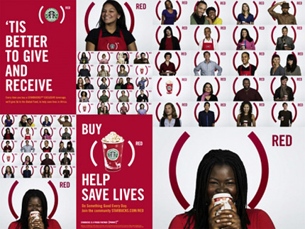

Starbucks Christmas promotion for the (RED) campaign
Graphic designers bear some responsibility for this oversimplification. Campaigns like "I Am African" feature celebrities in tribal face paint, presumably meant to symbolize a universal human connection to the difficulties facing people in Africa. The result, however, is a shockingly Orientalist image that reinforces the inherent power asymmetry between Western philanthropists and their objectified African counterparts.
In a Washington Post article, Uzodinma Iweala writes, "This is the West's new image of itself: a sexy, politically active generation whose preferred means of spreading the word are magazine spreads with celebrities pictured in the foreground, forlorn Africans in the back...There is no African, myself included, who does not appreciate the help of the wider world, but we do question whether aid is genuine or given in the spirit of affirming one's cultural superiority." I Am African? No, you are not.
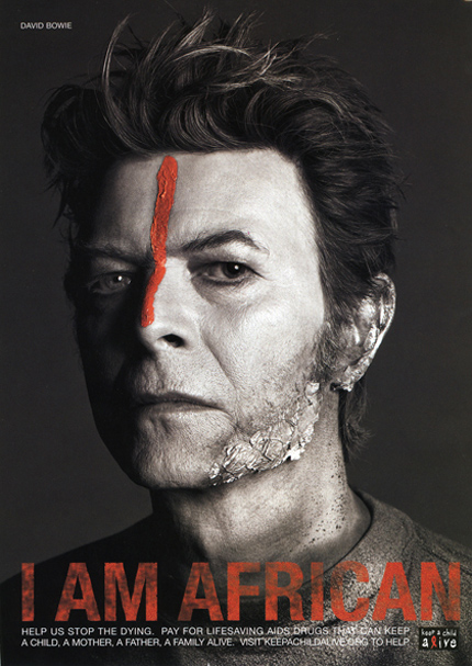

"I Am African" ad featuring David Bowie
Power inequalities naturally inhere in relationships between benefactors and beneficiaries. As designers, we can choose to reinforce those asymmetries or to recognize them and work towards their elimination. If we choose the latter route, the way we communicate becomes as important as the causes we communicate about. We need an empathic language that engages our emotions and challenges us to act.
Michael Bierut argued in Looking Closer 4 that designers have a tendency to set advertising up as a straw man simply because of its commercial orientation, positing that designers critical of marketing practices aim at "replacing mass manipulation for commercial ends with mass manipulation for cultural and political ends." Advertising itself is not the problem; while it is admirable for graphic designers to devote their skills to worthy causes, I don't see anything intrinsically wrong with creating ads for designer clothing or dog biscuits.
There is an emotional disconnect, however, when the same visual vocabulary used to market fashion is transposed onto a cause like global warming. Diesel argued in 2007 that their "Global Warming Ready" ads that juxtapose youth hedonism with images of a post-apocalyptic world represent a tongue-in-cheek commentary intended to provoke a serious discussion about environmental degradation. I "get" the irony, but I don't buy it. I believe in a graphic language that does not shy away from the reality of social crises but instead addresses those difficulties head-on in a manner unflinching and unpatronizing.
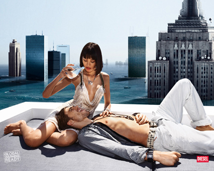

Diesel's controversial "Global Warming Ready" campaign
This, however, should not be equated with shock tactics designed to induce fear or intimidation. Recently, New York City rolled out a campaign against obesity designed to alert the public to health risks associated with the overconsumption of soft drinks. Labeled with the tagline "Don't Drink Yourself Fat", the posters feature globs of human fat pouring out of soft drink containers. While the ads most certainly make a strong visual impact, and it can be argued that they might make consumers think twice before their next Mountain Dew, the underlying assumption is that obesity is a choice.
In fact, social scientists have found a strong correlation between poverty and obesity, suggesting that the consumption of unhealthy food is associated with the inability to purchase bikini-body lifestyles. When McDonald's is the cheapest, most accessible option, it's no wonder that statistics for obesity are tied to wealth. Suggesting that overcoming obesity is as simple as eliminating soda assumes that individuals make choices absent of the particular social context they are situated in. Just imagine if coins were pouring out of the soda bottle, and the caption were to read "Don't Drink Yourself Poor."
That's not to say that we shouldn't educate people to drink water instead of Coke or that individuals shouldn't assume some measure of responsibility for their own livelihoods, but there has to be a better way than singling out fat people and telling them that they ought to be ashamed of their behavior. The NYC campaign and others like it do nothing to build empathy for people who suffer from obesity and instead reinforce existing stigmas and stereotypes.
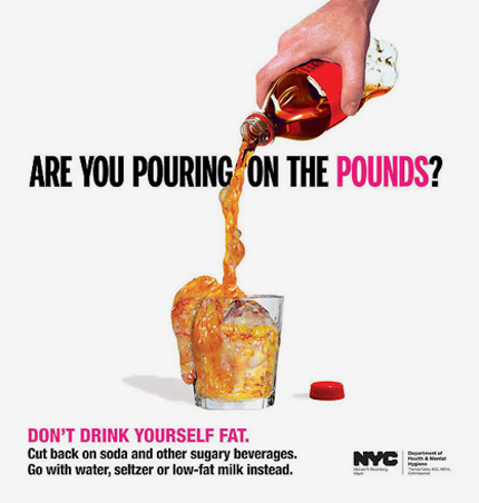

New York City's "Don't Drink Yourself Fat" campaign
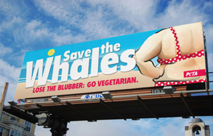

PETA's "Save the Whales" billboard
Certainly, there are instances when shock is appropriate and can help connect audiences emotionally to socially disenfranchised populations. More often than not, designs of this kind play an essential role in bringing necessary attention to problems that are easily ignored otherwise. In the best cases, they can serve as mouthpieces for people who face difficulties communicating on their own. Harry Pearce designed such a poster in 2006 for the New York-based charity Witness to raise awareness about human rights atrocities in Burma. Protestors from New York to Bangkok adopted the poster as a placard to voice their dissent against the oppression of military dictatorship.
Design can also open dialogues about social exclusion by resisting prevailing stereotypes. In 1994, Colors magazine broached the subject of AIDS with blunt, straightforward graphics that debunked popular misperceptions that AIDS was a "gay disease" that could be transmitted by using the same toilet as an infected person. The implicit argument behind the design was that our fear of the other is socially constructed into our cultural imaginary and that accurate information is the first step for assailing that fear.
It also featured a faux-obituary for Ronald Reagan alongside a doctored photo of the former president with Kaposi's sarcoma. While this design might easily be criticized for being equally as distasteful as the Coke-into-fat ad, one important difference is that it carries a universalizing rather than a minoritizing message: I don't care who you are, you are equally as susceptible to AIDS. The empathy of that message — admittedly wrapped in shock and controversy — may be the basis for successful shifts in social perceptions.
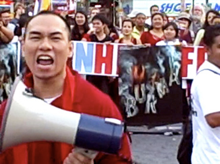

Harry Pearce's "Burma" poster out on the streets
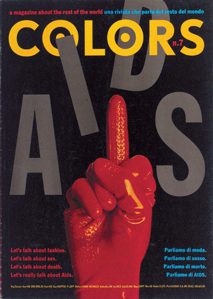

Cover of Colors No. 7: AIDS
Over the last week, I have been sitting in all-day induction sessions at the Helen Hamlyn Centre geared around getting me and four other new research associates up to speed on inclusive and people-centered design. The premise of this methodology is simple: design ought to serve as many people as possible and ought to center on fulfilling both the aspirations and needs of human beings, in accordance with a "human-centered" approach pioneered by the design innovation firm IDEO.
Most design caters to the "average Joe," he who is averagely tall, with average tastes, and no real handicaps. The truth, however, is that none of us are really average. People-centered design methodology focuses, instead, on socially-excluded populations. By creating ethnographically-informed design solutions that include those on the margins of society, the needs of the general population are also better met. Furthermore, this methodology does not merely intend to make life more tolerable for disabled or older people; it strives to fulfill their deepest aspirations. As such, it demands a collaborative rather than a top-down approach — "designing with" rather than "designing for."
We heard from Clara Gaggero and Adrian Westaway, two industrial designers who partnered with Samsung last year in order to make mobile phone technology accessible to older people. By asking older users to open the product box and try to use their mobile phone, Clara and Adrian discovered that older people tend to rely on instruction manuals for direction, while younger users experiment until they figure things out. The trouble is that the manuals are poorly-designed and completely inaccessible.
As part of the design process, Clara and Adrian asked older users to decorate bananas to demonstrate what an ideal phone would do. This exercise revealed that older people want step-by-step guidance through the usage of their mobiles, which led to the design of a manual die-cut so that the phone could sit inside it, each page providing simple steps by which a user can access a single function. The remarkable thing is that this design solution engineered for older people is helpful to all users.
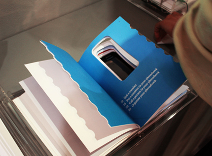

The redesigned mobile phone manual
As an exercise, we were asked to identify a social problem, assess that problem with user research, create a design brief, and propose a solution — all in the space of 24 hours. On the first afternoon, we walked around South Kensington and noticed the confusion and pedestrian hazard that local road work was causing. We interviewed a cafe owner who said that his profits had dropped fifty percent since the construction started in January because of accessibility and noise issues.
The next morning, we were paired with Adrienne (name changed), a legally-blind woman who suffers from macular degeneration. We found out from her that 90% of legally-blind people actually have some vision, and that we as designers should not take this for granted. By walking her through the construction area, we found out that the signage used to indicate pedestrian walkways was incredibly inadequate and often too text-heavy to be read. Green meshes used to prevent dust from going into sidewalk shops barely did their job because they weren't designed for the fences they were draped over and did nothing to prevent a trip hazard.
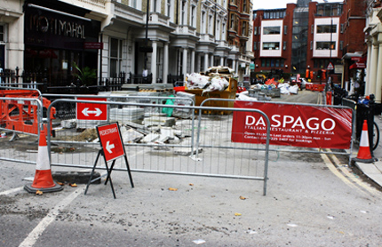

Confusing signage that is difficult to read from a distance
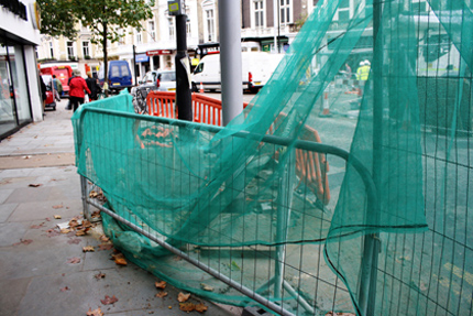

Ineffective meshes designed to keep dust out
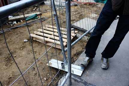

Fences designed to keep pedestrians safe become a hazard
We had about an hour to create a brief around our observations, think up a creative solution, and present it. With Adrienne's help, we decided to create a wayfinding system that used color to indicate safe zones for pedestrian mobility. We proposed that the existing green meshes be replaced by single-unit canopies that would drape over single fences, with green indicating pedestrian walkways and red signaling motorist routes. Instead of using small type, the meshes would employ large, unambiguous icons to communicate safe passageways. Furthermore, they would be outfitted with velcro strips to address the trip hazard issue.
While this design was created extremely quickly as an exercise, it was inspiriting to see anthropology and design work so well together. I've never felt more grateful for my training in sociology, and it surprised me how much we didn't see without Adrienne's perspective. Only through her eyes were we able to fully understand that most type-based signage is useless to blind people and that the solution is as simple as color-coding existing meshes. Like the mobile phone manual, a fully-developed version of this design could potentially be useful for most pedestrians and motorists, even if they don't have the same mobility difficulties that Adrienne does.
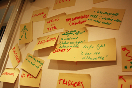

Surveying the problems with existing solutions
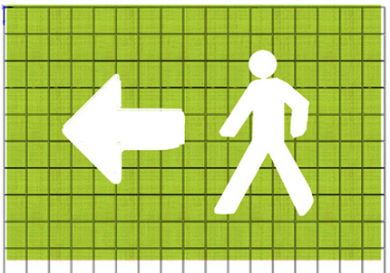

A schematic of the redesigned mesh completed 30 seconds before our presentation
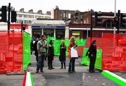

A super-quick rendering of our redesign
The challenge ahead seems steep: mine's is one of the first projects the centre has taken on that uses graphic design to address social perceptions of excluded populations. While the mobile phone project and our road work design brief were challenging in their own ways, they didn't have to confront social stigma. Is it naive to think that this "people-centered approach" is really a means by which empathy can be built? Is it arrogant to believe that graphic design can do just as much for older people living with sexually-transmitted diseases as it can for pedestrians in South Kensington?
Perhaps. But I did not choose this profession because I wanted to join a trend. Neither do I believe that designing for causes automatically makes me a better person. I do believe, however, that intentions are important. The last week has taught me that I need to start regarding myself as a designer and to stop worrying about how that will be perceived. The work I do does matter, and, if I'm lucky, it just might make a difference in somebody else's life.
